Mindvalley
2024

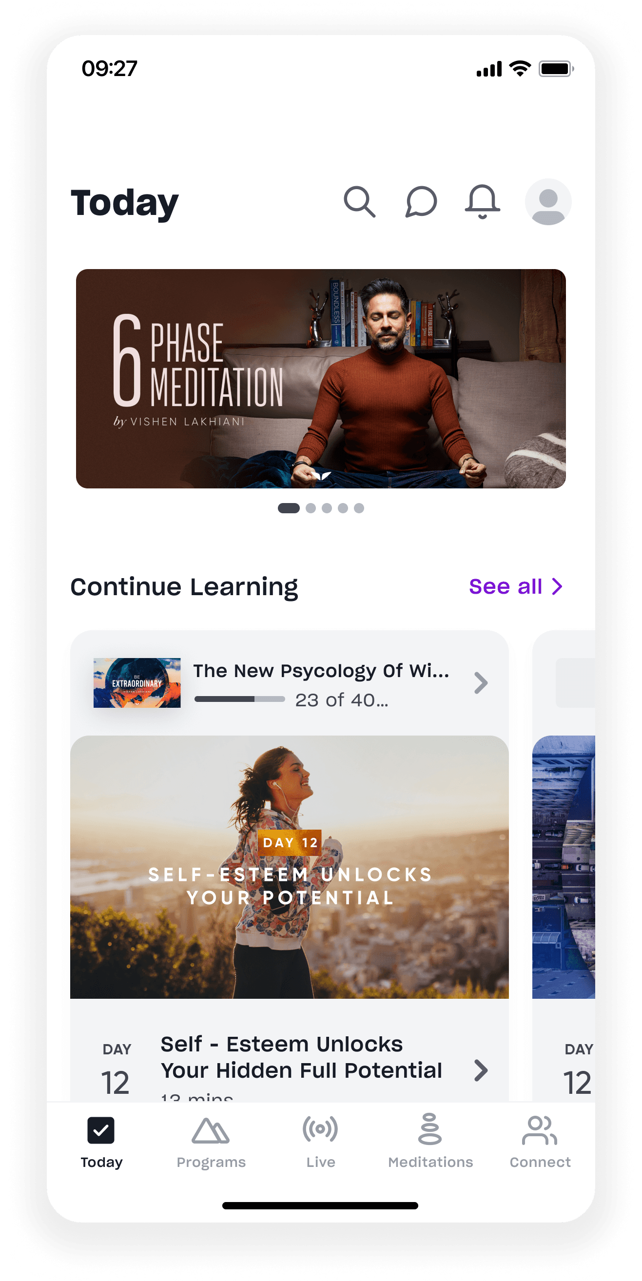
The library kept growing, but it wasn’t always clear what to do next. I led the design of Shorts, a short-form video surface that helps members re-engage daily and discover programs without feeling overwhelmed.
Role
Leading the design
Platform
iOS
Android
Timeline
2 months
Team
Senior Product Designer (Me)
PM
3 Developers
Data Science
Content Team
Impact
Daily Active Users
Users transitioned from Shorts to programs within session
Key constraints
No budget for new video production during beta
Large content library (110+ programs)
Older, non-TikTok-native audience (50–55)
Limited tolerance for dark-pattern engagement mechanics
The problem
Mindvalley’s content library kept growing, but discovery didn’t scale with it.
Finding what mattered became harder
With a large library, it became harder for members to quickly understand what was relevant to them. If someone fell out of routine, the Today page didn’t give them a clear way back in.
Momentum was easy to lose
Most programs were also high-commitment by design. Lessons typically ran 10- 30 minutes, and not everyone had the time or energy to commit to that daily. Missing a day often meant losing momentum altogether.
Engagement dropped due to friction and uncertainty, not content quality.
Hypothesis
If members could sample real moments from programs in short, low-commitment formats, they could build confidence about what to do next.
Short-form content could work but only if it:
Felt intentional, not addictive
Had clear boundaries
Linked directly into full programs
This couldn’t become “TikTok for wellness.”
Research and
content strategy
This work was driven by data and constraints.
I reviewed consumption data across top programs, support tickets, and ran 10 interviews focused on what happens after program completion. I also studied short-form patterns in wellness and education products.
Three things stood out:
Users liked short content but disliked endless feeds
Lesson snippets outperformed promotional content
People wanted help deciding, not more options
We had 127 existing Shorts, no production budget, and limited runway. After testing six content types, program snippets performed best (58%), while trailers and testimonials underperformed.
We capped the feed at 3 Shorts per day, giving 42 days of runway. Content quality was a hard constraint.
Key design decisions
Daily limits instead of infinite scroll
We capped the feed at 3 Shorts per day to create clear boundaries and avoid passive scrolling. Interactions were kept intentionally simple: vertical scroll and tap to pause only. Users were more comfortable exploring when the experience felt predictable and had a clear end.
Feature discovery and first use
Users initially struggled to notice Shorts and understand its purpose. I designed a lightweight feature introduction shown on the next app open. For beta, a temporary looping video was used to quickly set expectations.
Timed program CTA
The “View Full Program” drawer appeared five seconds before video end.
Earlier triggers disrupted viewing. This helped already invested users dive deeper into the topic.
Onboarding placement
Initial onboarding appeared after the first video, but many users exited before reaching it. We moved this animation to the start of the first Short, prompting users to scroll vertically to discover the next video.
Results
Beta performance over the first two months
Shorts drove measurable movement where discovery mattered most.
9%
increase in program enrollment attributed to Shorts
13%
users transitioned from Shorts to programs
7%
increase in DAU within the beta cohort
Engagement quality supported those outcomes
65% completion rate for Shorts under 60 seconds
~45 seconds average watch time per Short
Content performance
Authentic content consistently outperformed promotional material.
The core issue wasn’t motivation. It was figuring out what content suits them best.
Reality check
Five months after launch, engagement declined.
The primary cause was not interaction design.
Content strategy shifted toward marketing-heavy content, with trailers replacing authentic lesson snippets. As trust dropped, usage followed.
This reinforced an early insight: Shorts only worked when content felt informative and honest.
Connect
Explore